Parched Crow Wines
Parched Crow Wines approached Shiplee Studio to refine their brand and create a new suite of wine labels that felt timeless, considered and true to their connection to the Hunter Valley.
The focus was to develop a visual identity that could stand confidently on a shelf while still feeling personal and grounded in place.
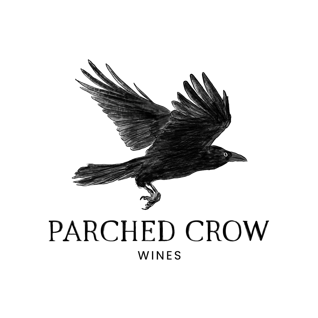
The direction centred around a hand-drawn illustration of a crow in flight, paired with classic serif typography. This was supported by subtle, hand-rendered elements — including a loose interpretation of the Hunter Valley landscape — bringing a sense of authenticity and story to the final outcome.
What We Did
Brand Identity Creation
Hand-Illustrated Logo
Wine Label Design
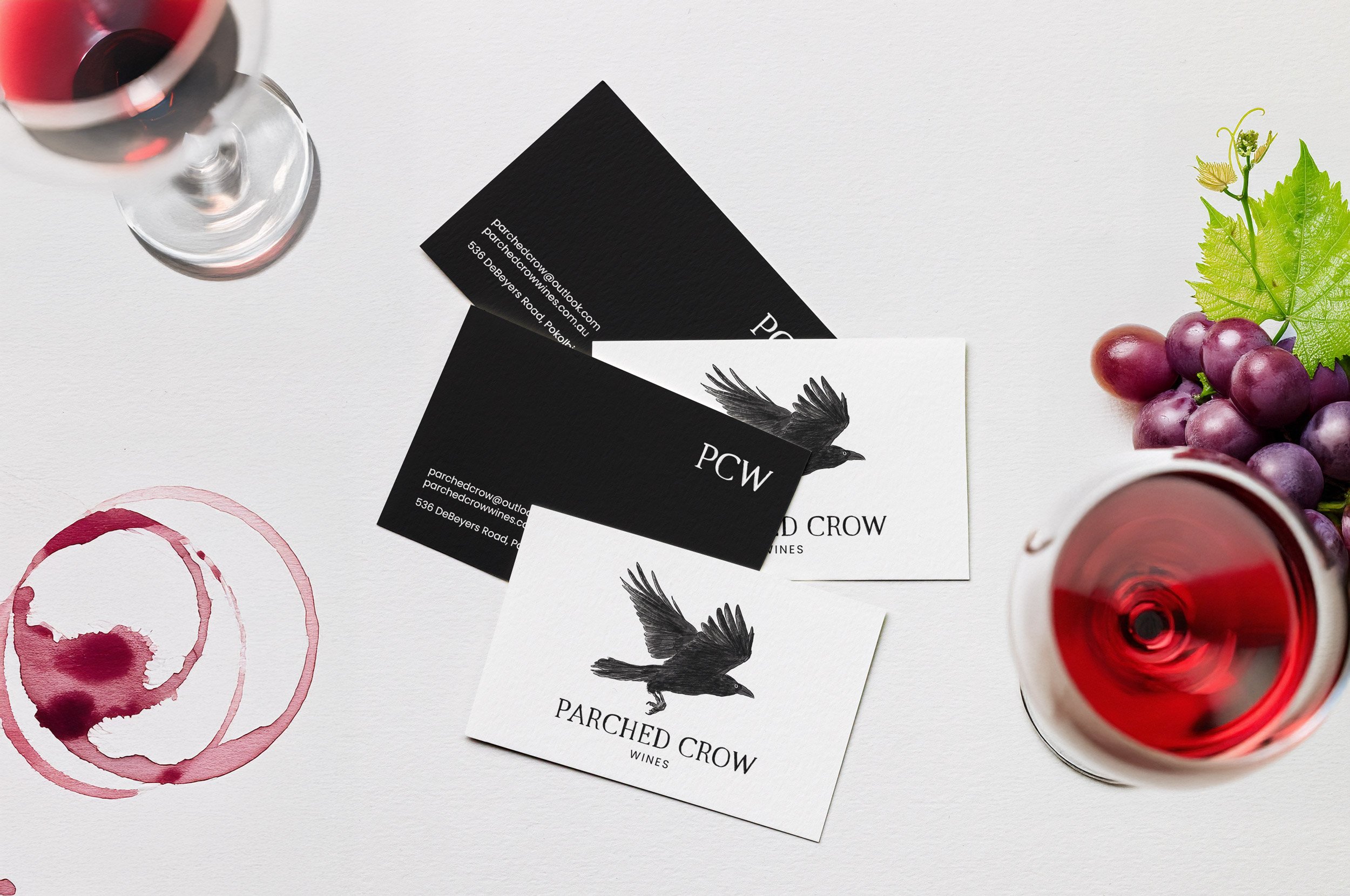
Business Card Design
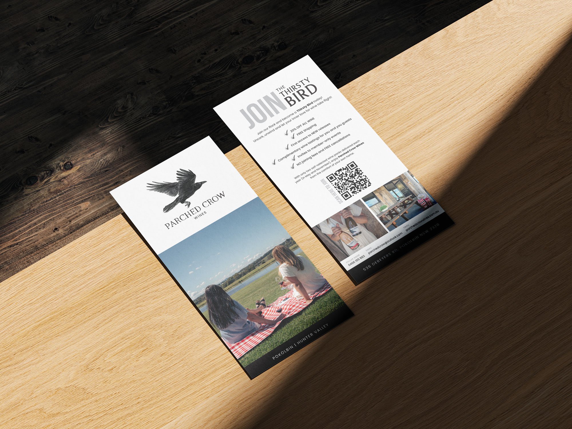
Brochure Design

The final brand feels cohesive, confident and distinctly its own.
The wine labels now balance clarity and character — standing out on a shelf while still feeling refined and timeless. The introduction of hand-drawn elements adds a layer of personality and connection, grounding the brand in both craft and place.
Together, the identity gives Parched Crow Wines a stronger, more recognisable presence, supporting both their product and the story behind it.